Hey friends
Hope y’all are doing well. Recently uploaded a YouTube video about the Best Movie Posters and thought…
I wanna write about it too, so here we are :)
Most Movie Posters Suck Now
They say never judge a book by its cover,
but no one said anything about movies.
Since the beginning of cinema in Hollywood the movie poster can be the deciding factor if someone wants to watch or not. As hyper-capitalism has taken over every industry (film included) movie posters have become bastardized.
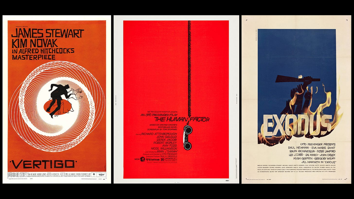
We went from amazing stylistic works of art like these Saul Bass hitters.
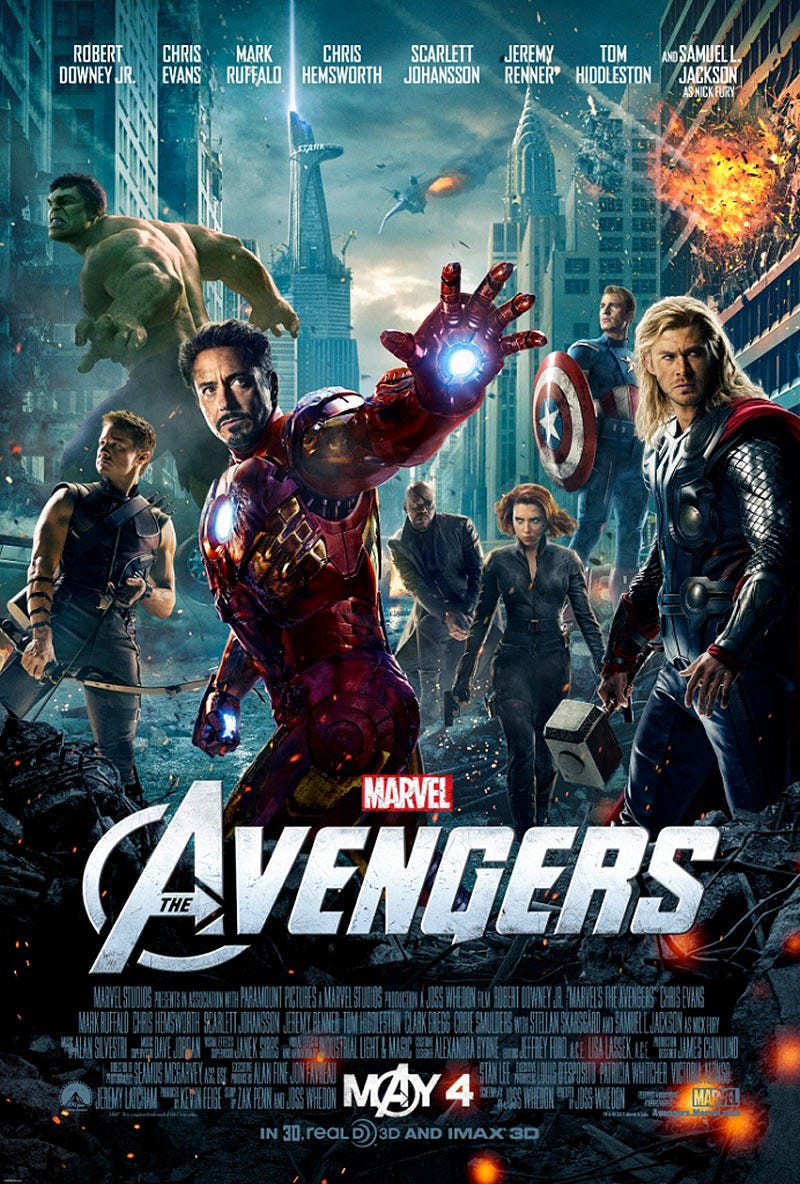
To this shitty avengersfication style
I understand that this format has its own lane but it has bleed over to all kinds of genres.
I know firsthand from working at an agency that made movie posters in LA, whenever a unique idea was pitched it was usually shot down in favor of this Marvel style.
It’s all rooted in making the most money too. If the production company is paying someone like Brad Pitt or Tom Cruise, they are going to want his giant ass head on the poster to sell tickets.
It’s not about how good the movie is, it’s about who pays to watch it.
It really is the Hollywood version of clickbait in my eyes.
However, there are a few production companies out there that are more or less about the art.
The one I’m speaking of today is no other than A24.
Do they make the best movie posters??
Maybe…
All I know is there better than shit like this
So let’s chat about some of my favorites.
My Top 5 Fav A24 Movie Posters
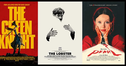
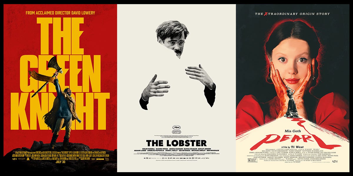
001. Pearl
I really like this Pearl movie poster not only because it's well-designed overall but because it takes a lot more risks than what I'm used to seeing these days.
This reminds me of a poster you would see someone make as fan art or a really good illustrator would whip up and post on Instagram.
However, it's the official key art and even with the billing block/everything at the bottom it still holds up as a nice composition.
Honestly, I love the little black-and-white threshold style illustration in the middle so much.
Strong type, strong composition. great colors and just an amazing poster overall
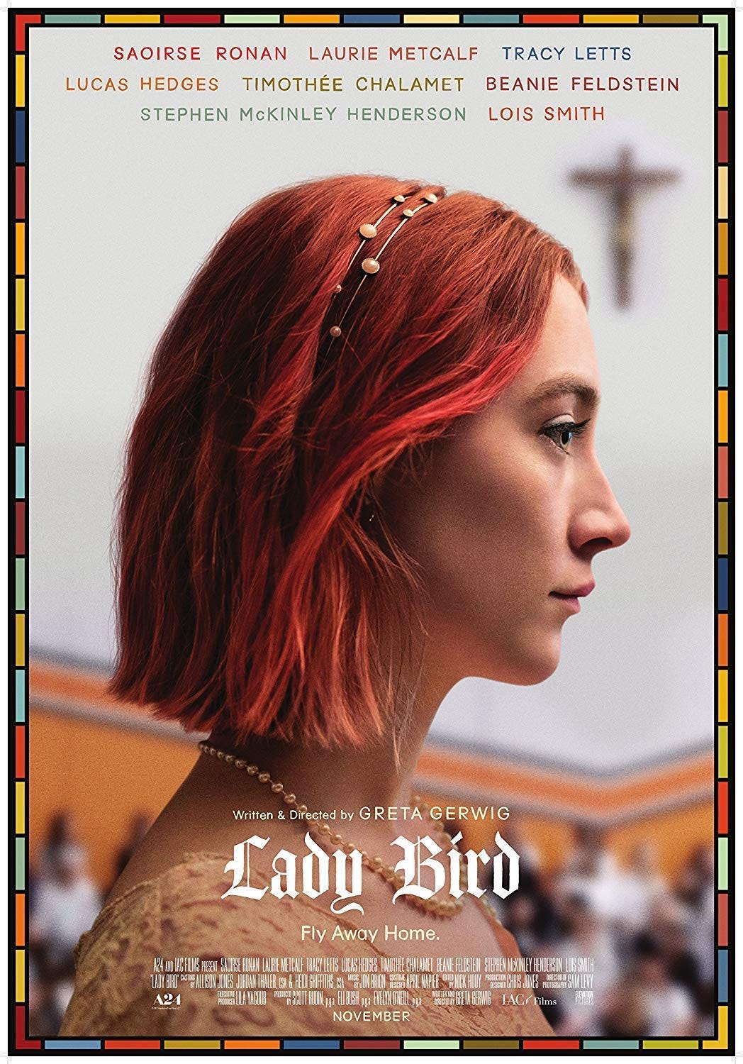
002. LadyBird
This Ladybird poster is pretty simple but I think it has to be one of the best ones I reviewed in the video.
Not only is the entire composition designed very well but the typography is super nice and I love the color matching between the actor's names and the tiles on the outside border.
The tiles are very reminiscent of something you'd see in a church like those stained glass panels and the subtle hints of red help bring the composition together with the main actress’s hair.
I mean it's pretty impossible for Old English to look bad, that ladybird type down there just sits really nice.
The thing that makes this so strong overall is not only is it a well-designed but it accomplishes the goal of what any business people would want in a movie poster as well.
It shows the main actress large and in the center which helps sell the movie but without falling into the shitty floating head trope.
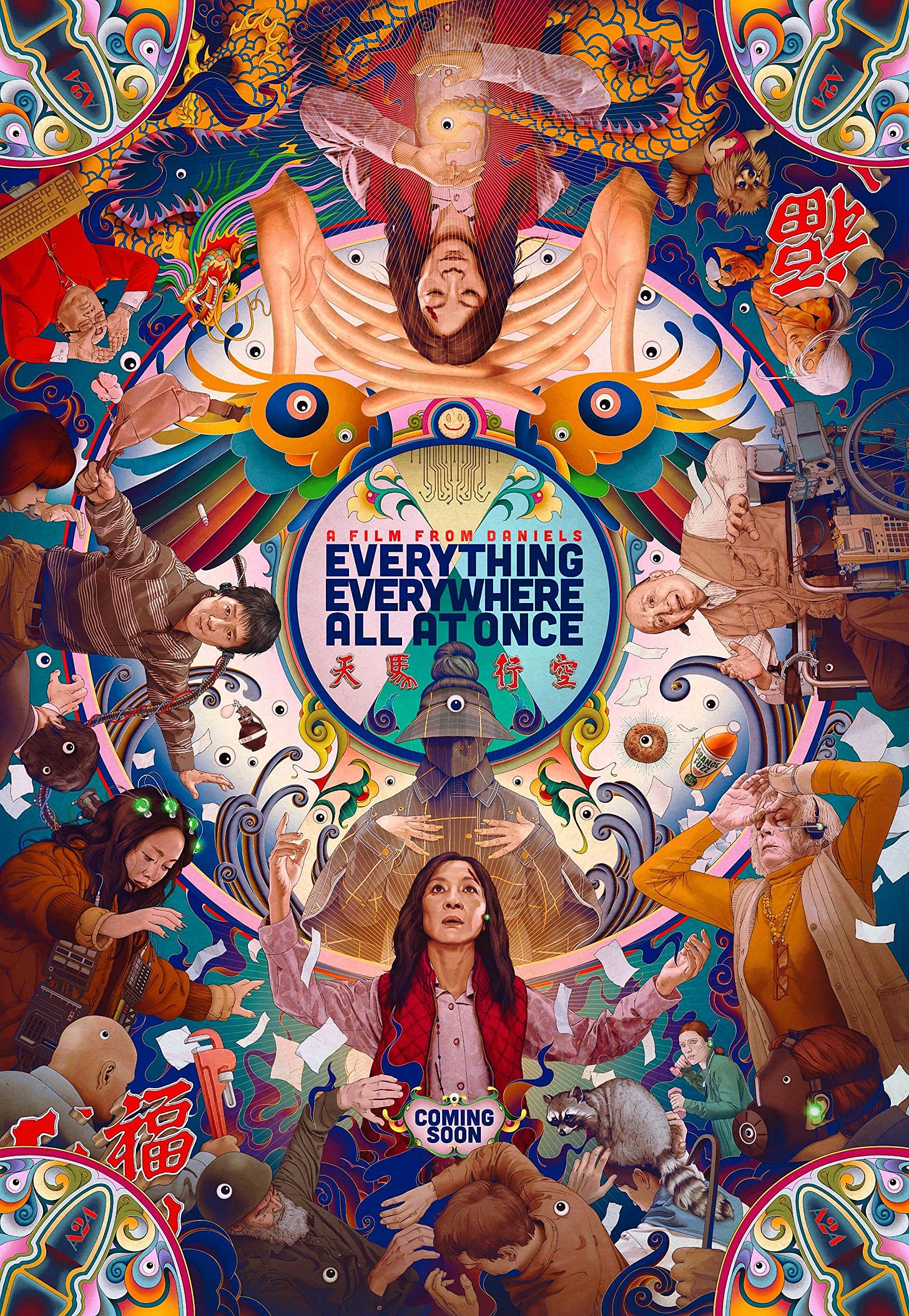
003. Everything Everywhere All at Once
Usually, I'm not a big fan of these maximalist-type posters however this illustration is done so well and I love all the little Easter eggs inside of it.
it's almost like if you tried to imagine an adult version of Where's Waldo but also on acid.
Not only is this poster designed very well, but it encompasses the feeling that you get when you watch this movie. There's a lot going on and quite a bit of of hidden meaning and it's just kind of sensory overload.
What's cool about this too is even though it's a strong poster at face value after you watch the movie you can come back and look at this and find all the little hidden gems that now have meaning to you
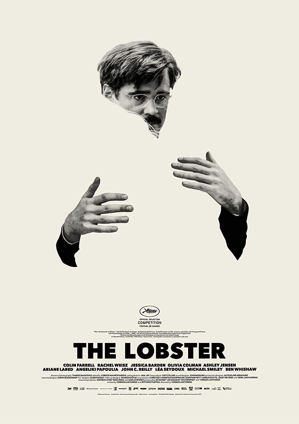
004. Lobster
I'm sure you've seen this poster before all over Pinterest or some kind of design repost page.
This is almost the exact opposite of the everything everywhere all at once poster but still designed amazingly.
This is minimalism done right, a style that can very often be executed poorly.
The amount of detail you can get in the negative space by just those strands of hair that go over the main actor's face is beautiful.
I also really like the use of Futura and how they stacked the entire billing block and jammed all that information in there without that lockup feeling overly crowded.
It's also pretty cool how this cream color suits it well but you could really place this composition on any colored background and probably work just as strong.
005. The Green Knight
This green night poster is tied for probably my favorite out of all the ones I reviewed in the video, It's just so different from what you usually expect in a movie poster.
I really like how they took risks and created a composition that relies so heavily on this big type.
The type is also subtly customized too and I love how the main person in the poster overlaps with the typography just enough to where it can create some visual interest but still remain legible.
The color palette pop as well and it has a nice subtle texture without being overbearing, it just reminds me of some kind of poster you'd see scrolling Instagram or on a cool wheat paste somewhere in the city.
I would love to see more types of typographically driven posters like this in the mainstream.
If you want to see my thoughts on the 20+ more movie posters then check out my latest video!
Stuff to Check Out
Beautiful font by Margot Leveque
IG Post of the week below
Closing Thoughts
What is your favorite movie poster??
Weekly Wrap Up
Graphic Designer Ranks the Best Movie Posters | A24
Thanks for reading. This newsletter is a reader-supported publication. I plan on keeping this newsletter free, but if you want to support, the best way is to buy me a coffee:)


