


Filling the void with passion projects
HxC Series so far and more

Hey friends
Hope y’all had a good week and are excited about the upcoming holidays.
How the series has been goin’
There are always ebbs and flows as a freelance designer, but this drought has been particularly long and anxiety-ridden.
If I am being completely transparent with you all, I haven’t worked on a good client project for over a month now.
Don’t get me wrong, I’ve had inquiries, but they don’t fit the goals I have for projects at the moment.
Budgets arent aligned or just the classic getting ghosted by a promising-looking client.
I think I’ve been on 5 client onboarding calls in the past few weeks that all have flopped…
I fucking hate Zoom calls.
You know what the weirdest part is though, I am completely fine in the financial department.
I have finally reached my goals as a “content creator” of being able to make a living off just design content and no projects.
I always dreamed of that stability when I first started posting on YouTube in 2020 and now that it’s here idk, something feels off…
This is a wonderful feeling and simultaneously gives me the worst case of imposter syndrome.
It’s so cool to be able to be more selective with client projects and make money in other ways with brand deals, YouTube adsense, Kofi, etc.
However, I still have goals that aren’t monetary in the design world.
I want to design more album art, movie posters, and branding systems for companies and artists I admire.
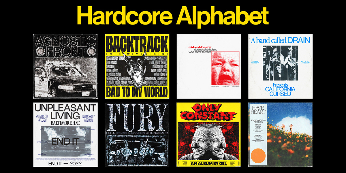
This is why I have been filling this client downtime with content and a personal projects series I have been working on “The Hardcore Alphabet”
I spoke about this series and the power of doing personal projects in this video here but I also wanted to chat about it with you all right now.
The series has honestly been going so well for multiple reasons.
First and foremost I love the work I am creating and getting back into that rhythm and sense of creative flow state that comes with self-imposed deadlines and consistency.
I am doing my best to hone the styles I already love and branch out into some new things with each of these album art redesign concepts.
Having a reasonable creative task to do each week helps me feel accomplished and the right amount of productive.
The second awesome surprise of this series so far is the valuable connections it’s making me.
I chose the theme of this project to be hardcore bands because I love the music, the scene, and have been going to so many more shows lately.
I also realized that a lot of the visual design in these communities is created by active members of this niche so it only can help to be more involved.
I figured a few of the bands would be stoked about the redesigns but a bunch so far have turned into awesome leads.
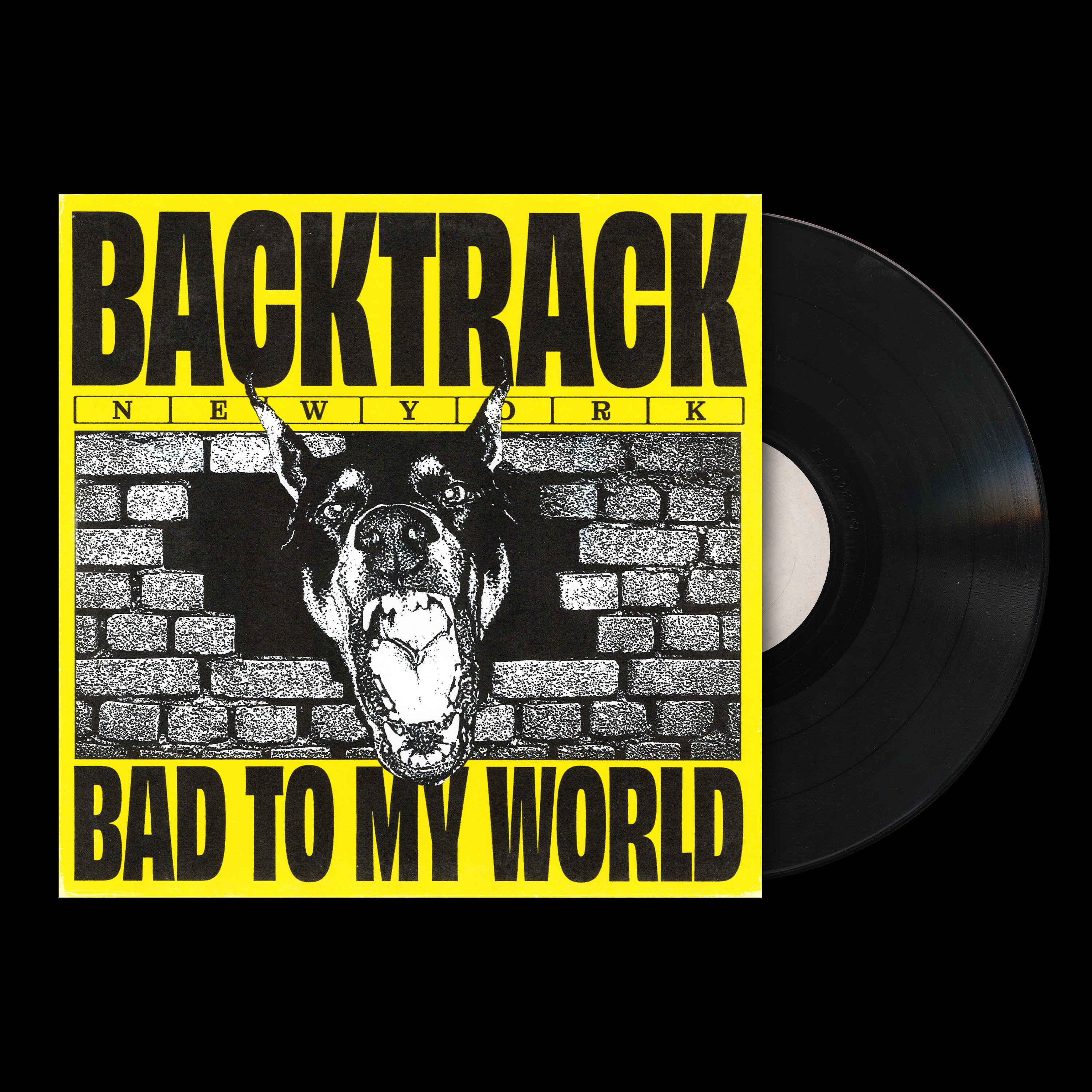
Doing this backtrack design helped me connect more with the awesome guitarist Ricky Singh, who’s the owner of one of my favorite hardcore labels Flatspot Records
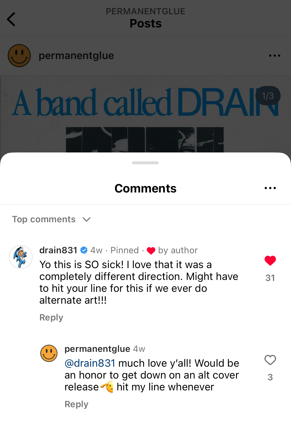
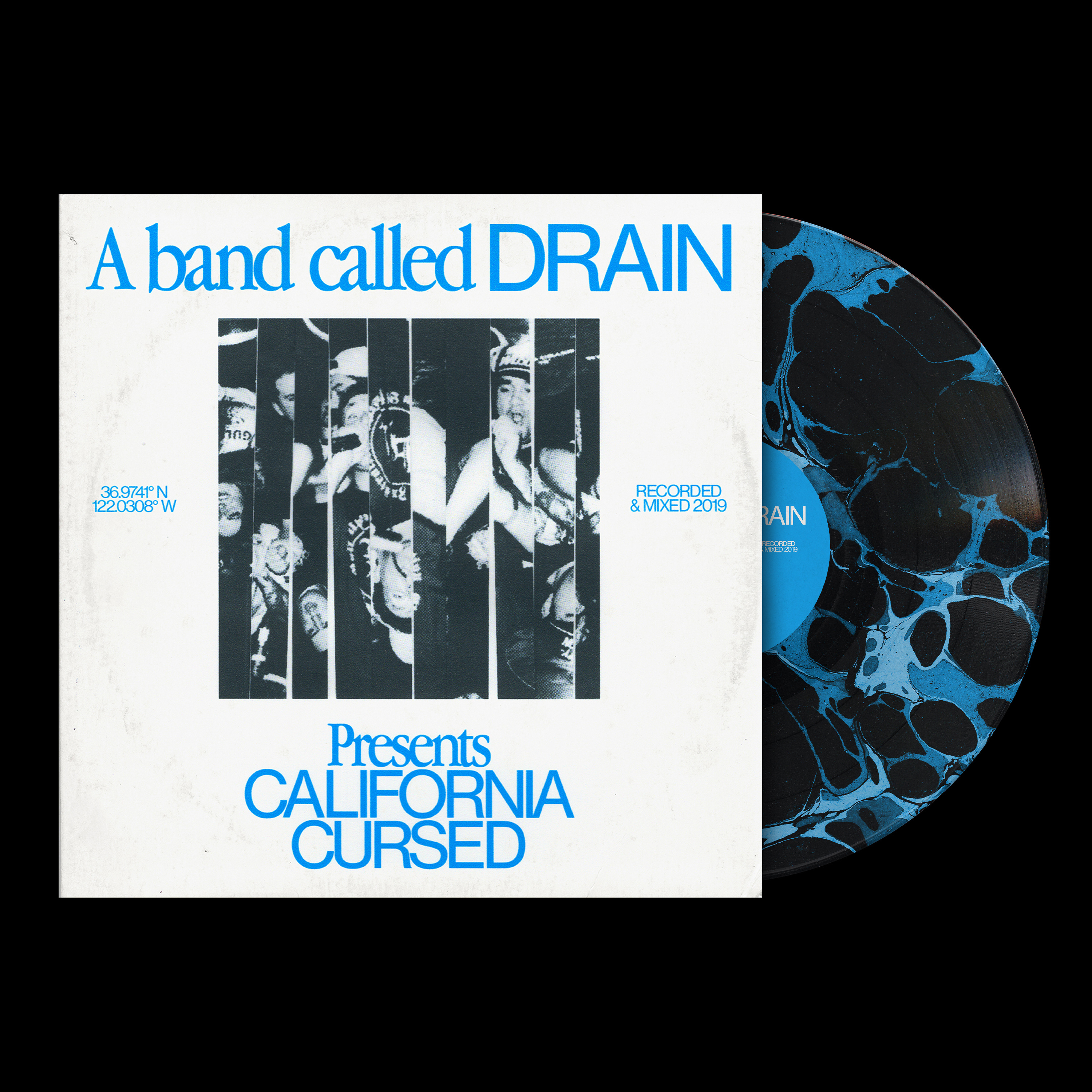
When I worked on the Drain redesign, I got this amazing comment from the band and a few of the members followed my IG page.
That isn’t anything too crazy for the present moment, but may turn into something down the line.
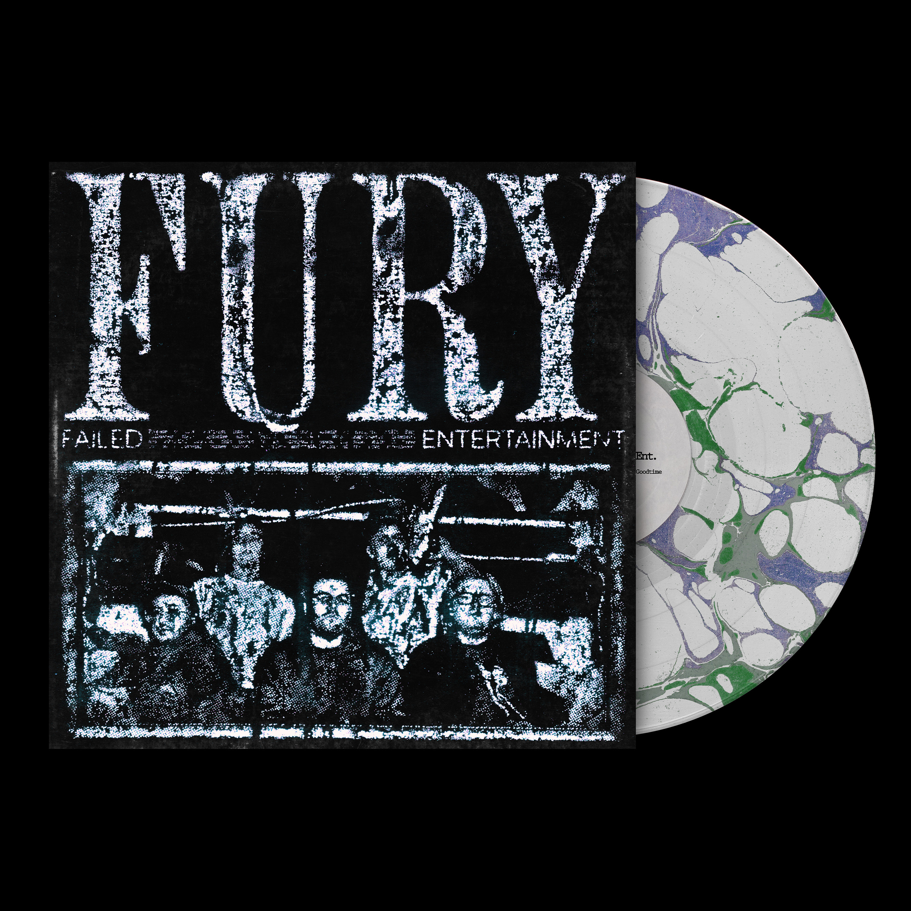
Working on this fury redesign, helped me try out some new techniques with printing and stamp effects. I really tried to brand away from traditional design rules while still keeping the system cohesive.
shoutout to Doron for putting me onto the base technique that helped out its finished design.
Not only has this project helped me get connections in the music world, but has furthered some in the design world as well.
For my most recent redesign for Incendiary. not only did the band comment and (may or may not have reached out about doing merch…) but I also got to collab with an amazing designer and friend Jake Pressure.
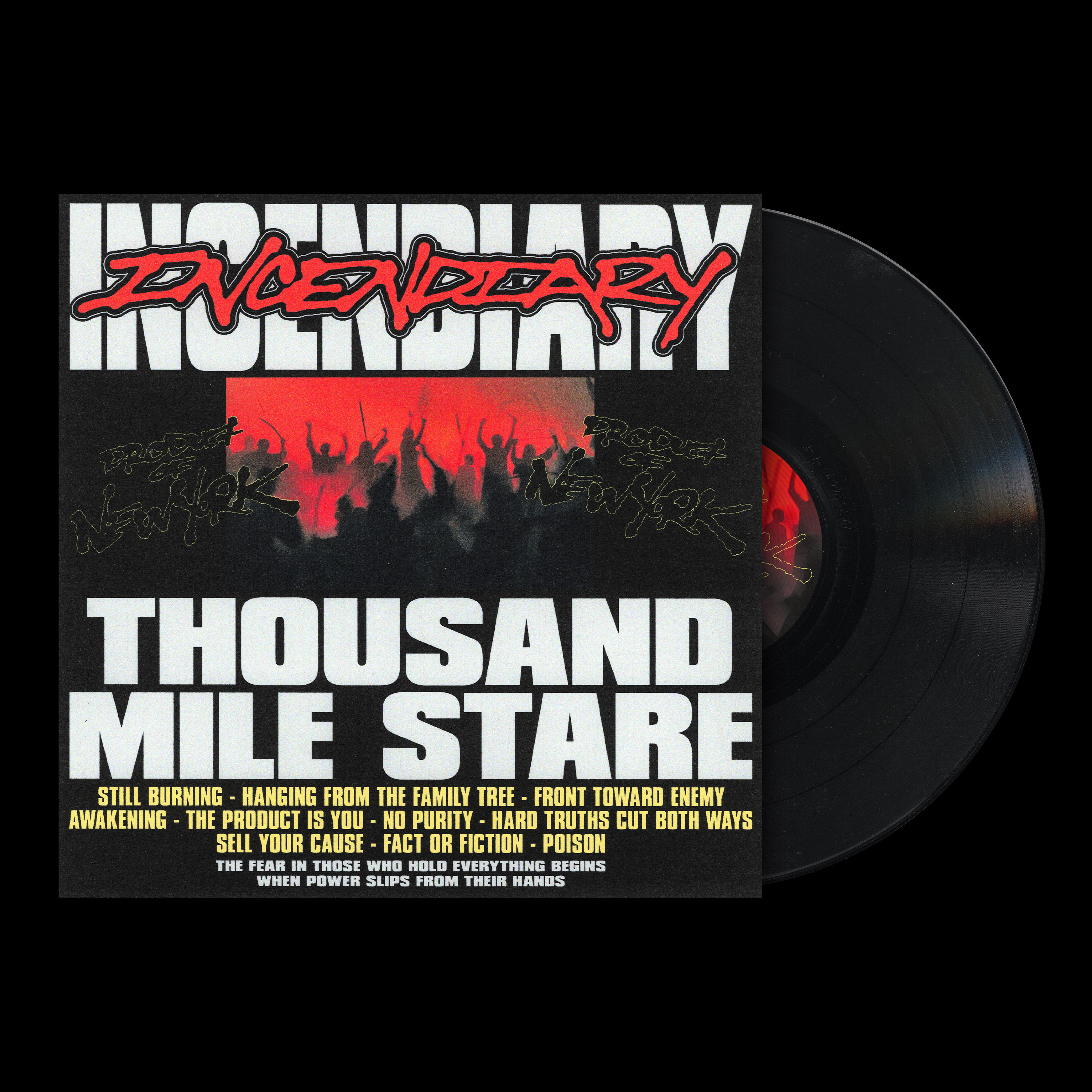
I have looked up to Jakes's work since college and at the time I felt so removed from the “cool” talented designers in the space.
It’s honestly a crazy full circle moment to not only become peers with Jake but get to work on this concept with him, He killed it on the custom type and I’m stoked to work more with him and other talented designers in the space.
Always looking to do collabs in the design and video space, so feel free to hit me up with a good idea.
I’m stoked to keep working on this project, it has truly been so fulfilling.
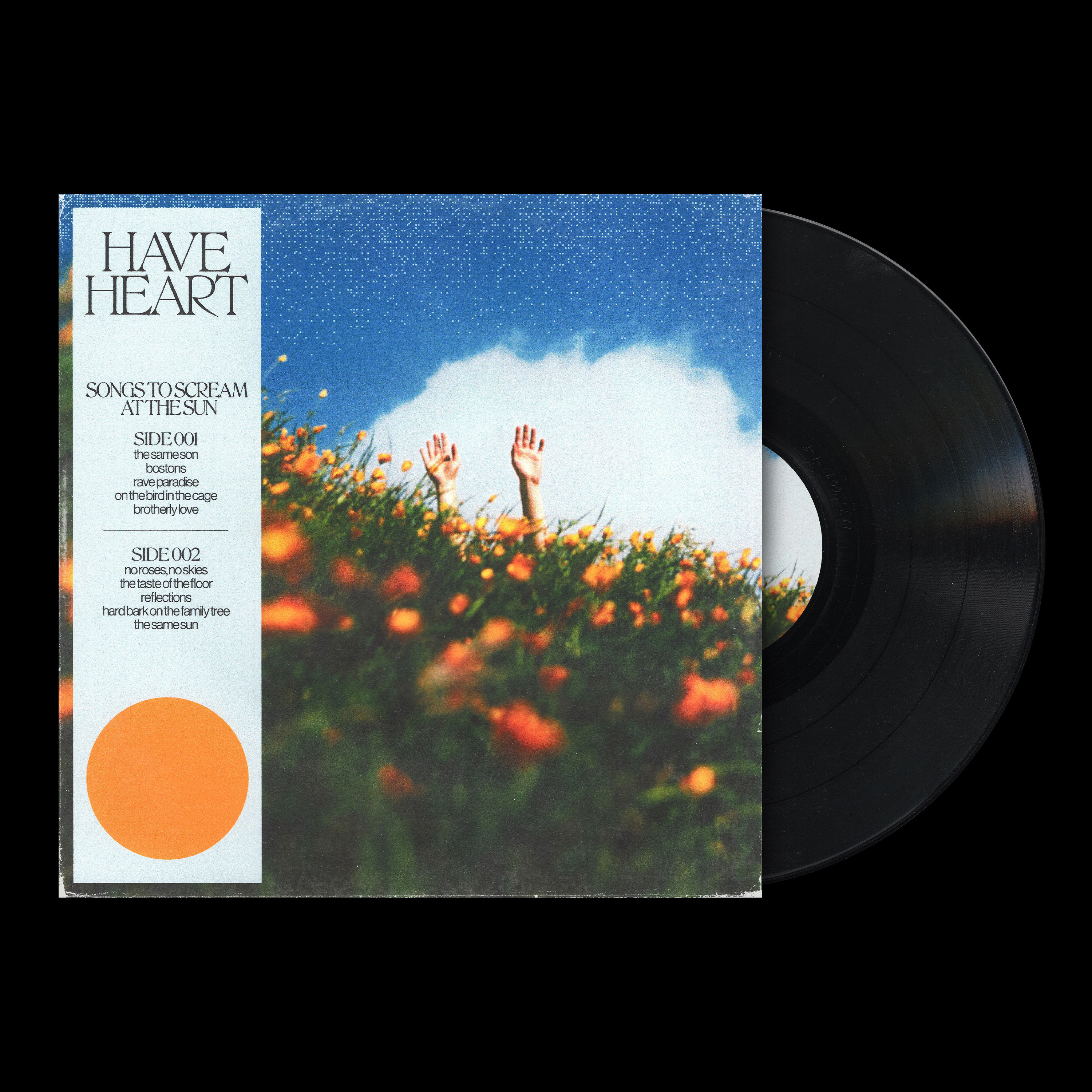
This Have Heart redesign has probably been my favorite one so far, so wanted to share that too.
Lastly, I have a little sneak peek for y’all.
Since the glues letter subscribers are the best supporters out of all these social sites and whatnot, I wanted to share the next design with you before it goes live.
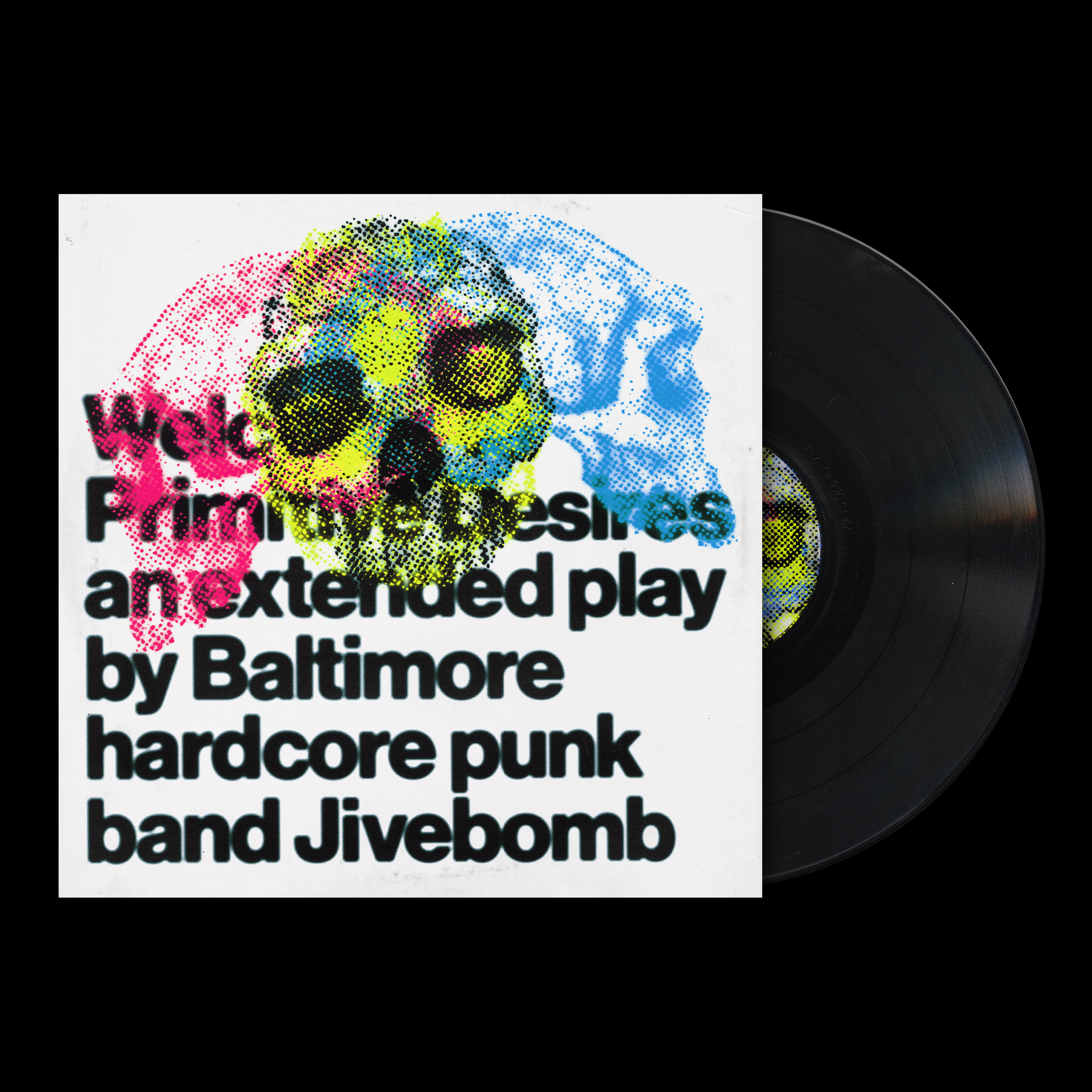
This one is for Jivebomb.
I wanted to experiment with overlayed printing techniques and some typographic layout. I also have been branching out a bit more into more art-driven directions and trying not to “over-design” for the sake of flexing traditional graphic design skills.
I am trying to stay true to what I would actually want to see on the real album art and not just the fanciest graphic design stuff.
I was really happy with this one and stoked to finish off the rest of the series!
Much love and talk soon🧡
Stuff to Check Out
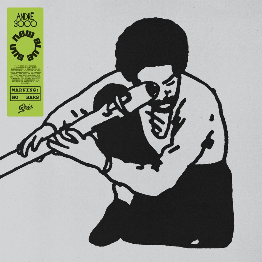
Fav Design of the week below

Andre 3000 vinyl cover art by the great Braulio Amado
Weekly Wrap Up
Day in the life of a graphic designer (recharging my creative energy)

Thanks for reading!
I plan on keeping this newsletter free, but if you want to support, the best way is to buy me a coffee:)