

Bigger Projects, Bigger Problems

How's it going, everybody? Hope you are doing well.
I have been working on a bunch of client work behind the scenes lately and it got me thinking about a few projectsI worked on last year that ultimately didn’t pan out.
It’s always a bummer when you spend a bunch of time on something and then for 1 of the 100 various reasons, the final product dosen’t get to go live
So here is a little “case study” if you will, about this project i worked on for the band Architects.
[ARCHITECTS LOGO CASE STUDY]
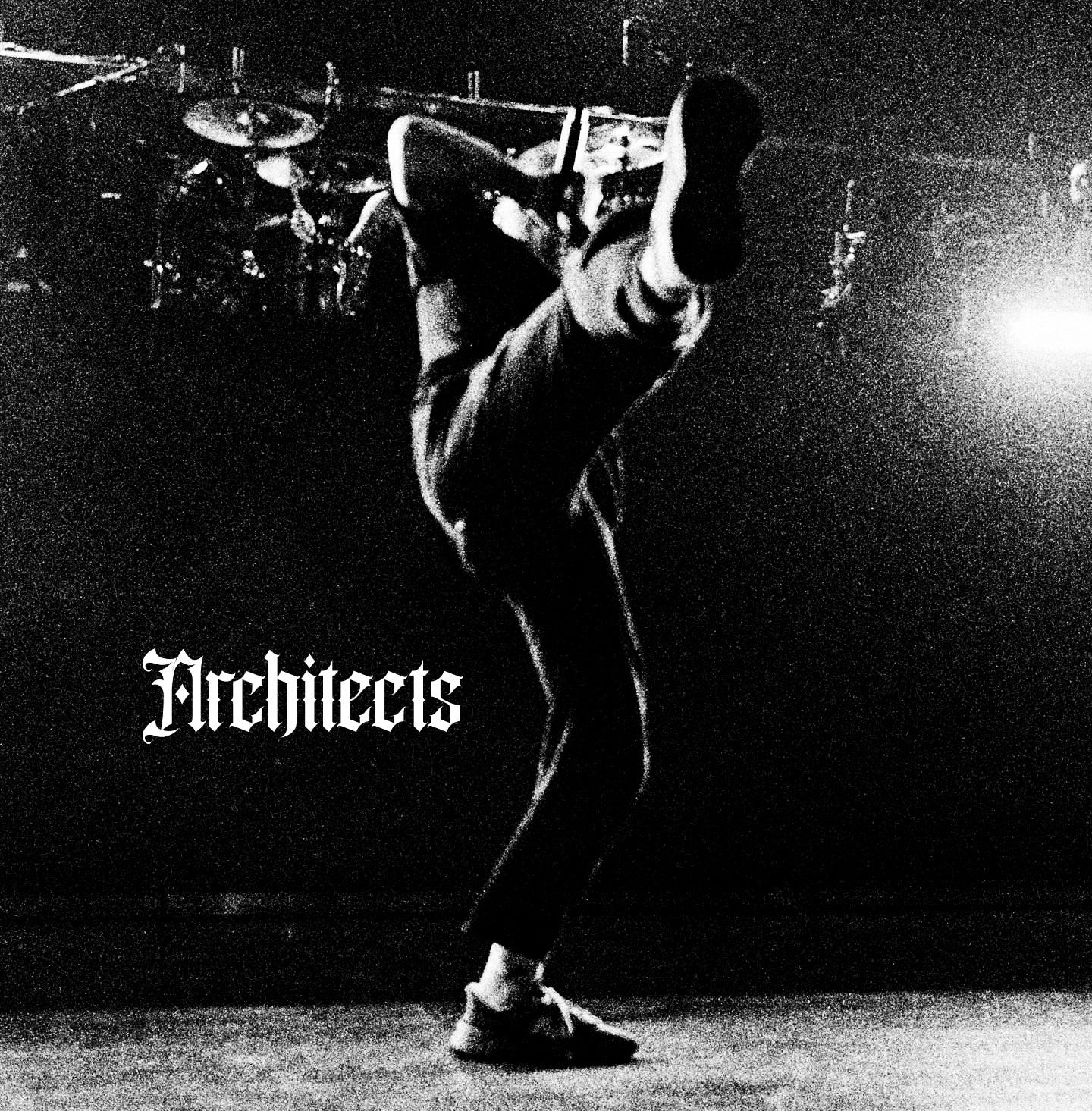
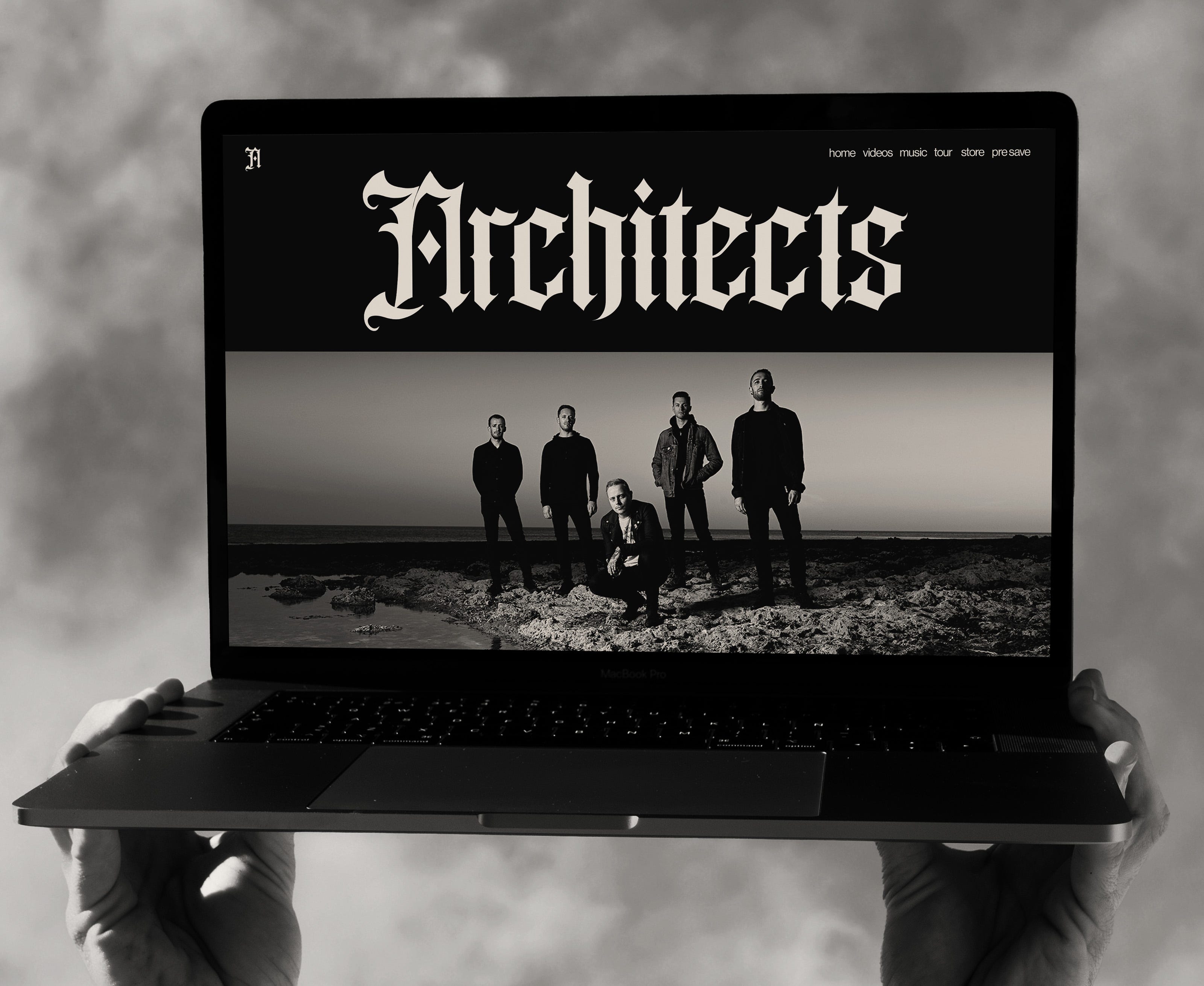
So i got the amazing opportunity to work on a logotype for heavy music band Architects.
Pictured above is 1 of the 3 final logotype i presented to the clients and probably my favorite final version.
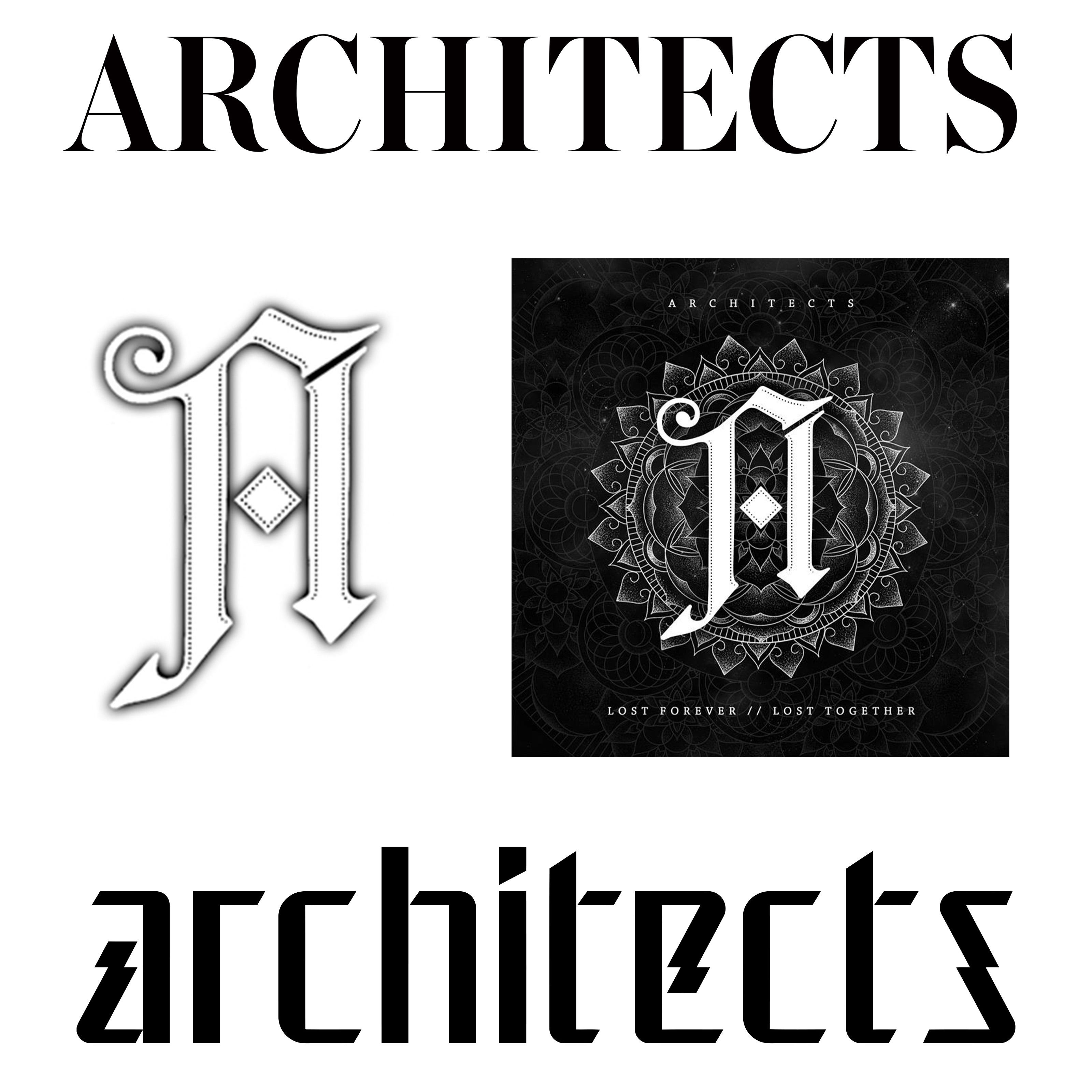
The Architects have went through a few logotypes over the years, all have had a very different style.
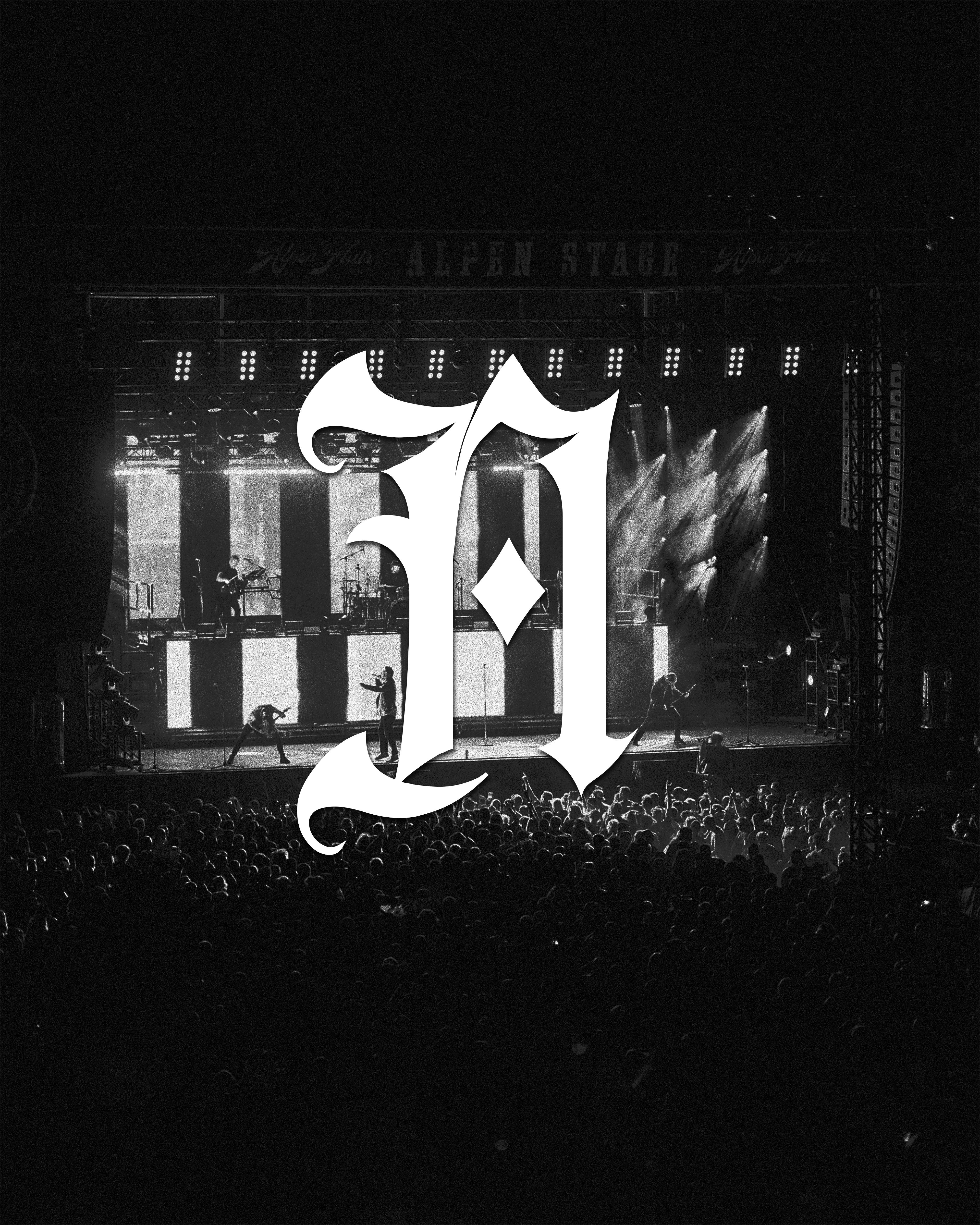
They also have this distinct “A” logomark that many fans have grown to know and love.
My goal was to fulfill the vision the management team had for Architects of creating a new logotype and “A” symbol to bridge the gap between and make the whole system more cohesive.
Below are some of the branding the band was currently using.
The 2 different logotypes, and many edited versions of the “A”
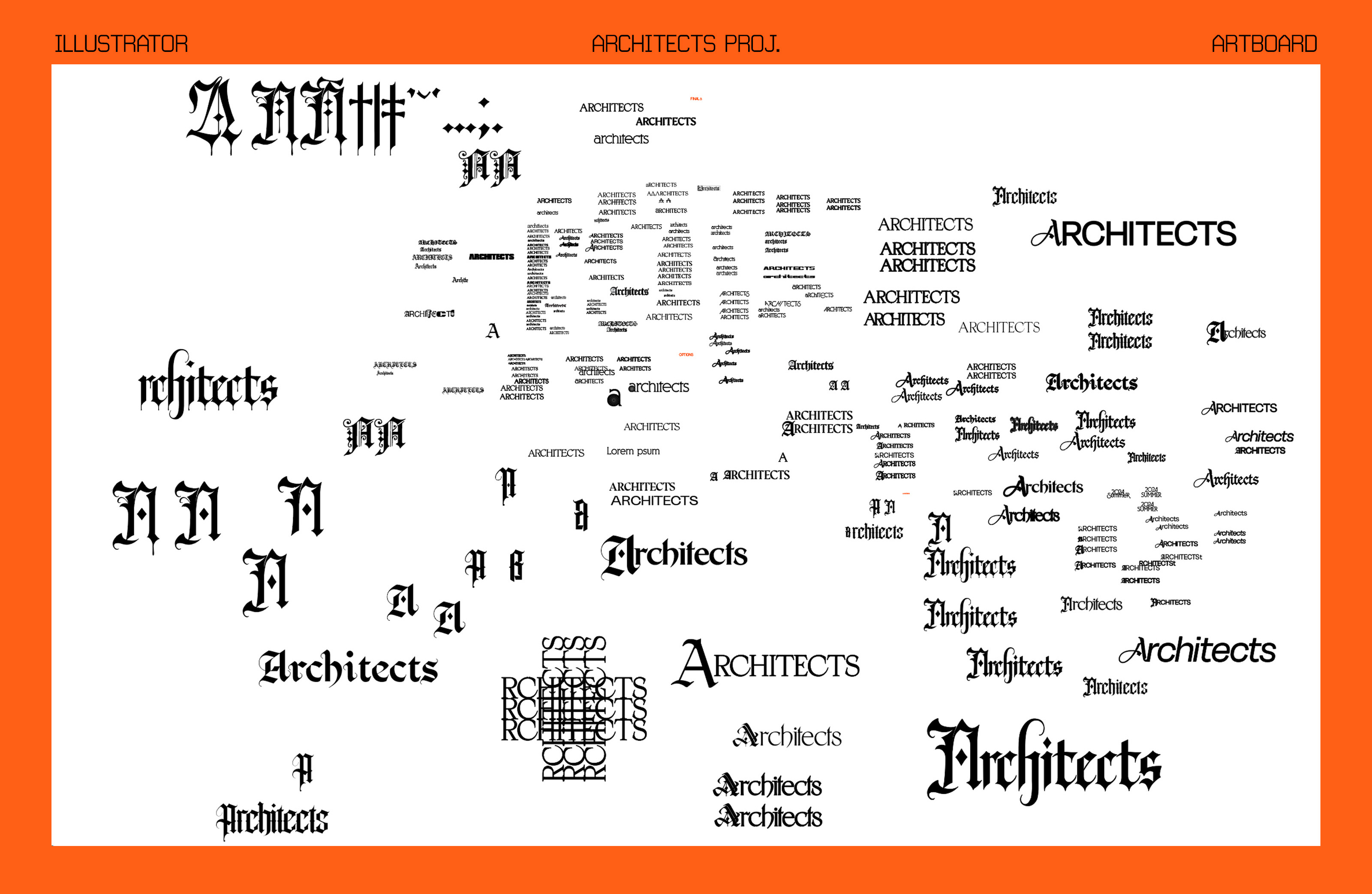
I started by working on a bunch of logotypes, ultimately I landed on 4 to present, This is what the artboard usually looks like though for any branding or logo project, regardless of scale.
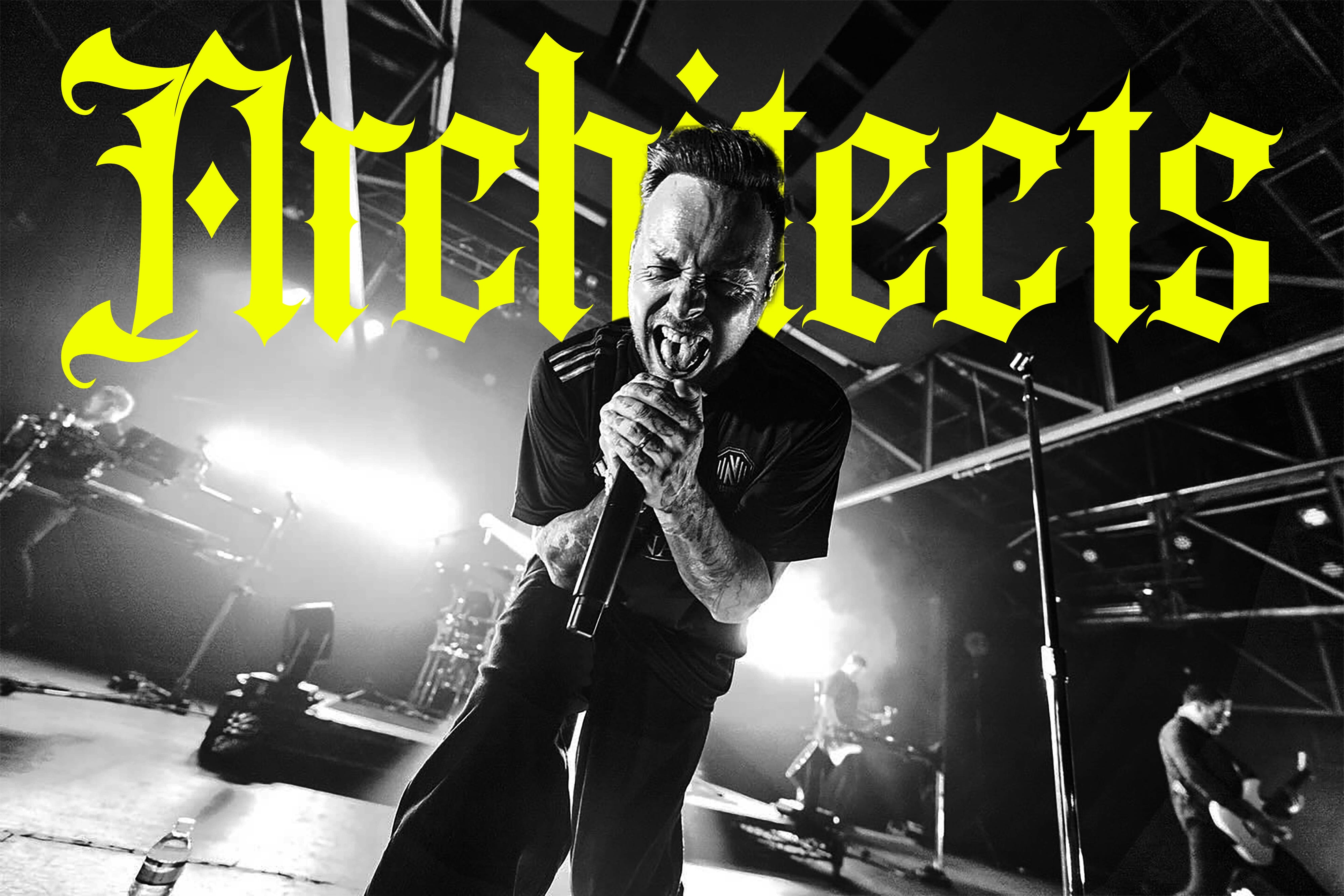
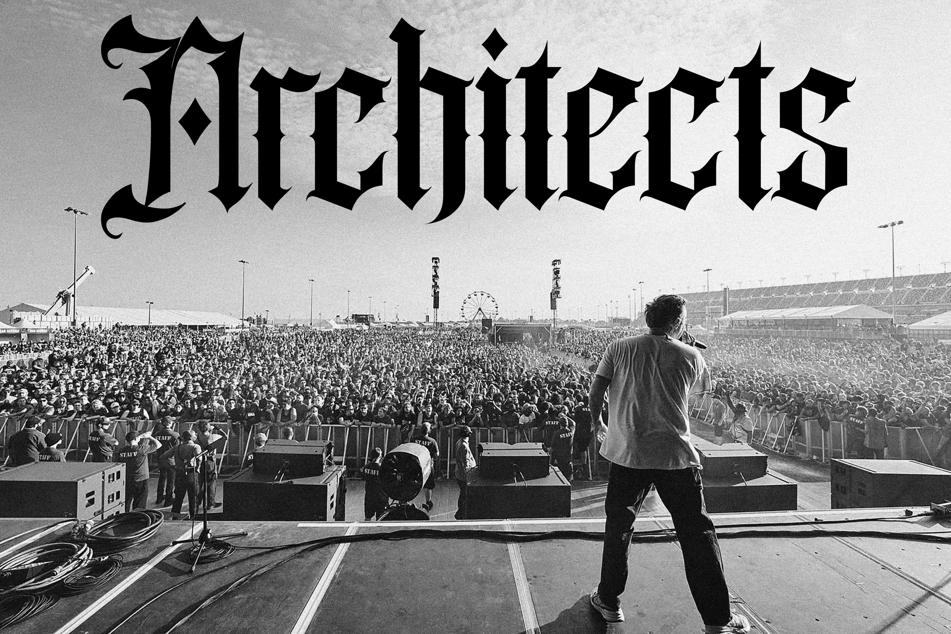
Out of all the versions my favorite ended up being this one below. I liked how it felt like all the letterforms were from the same family and the “A” could be used stand alone or as part of the full lettering family.
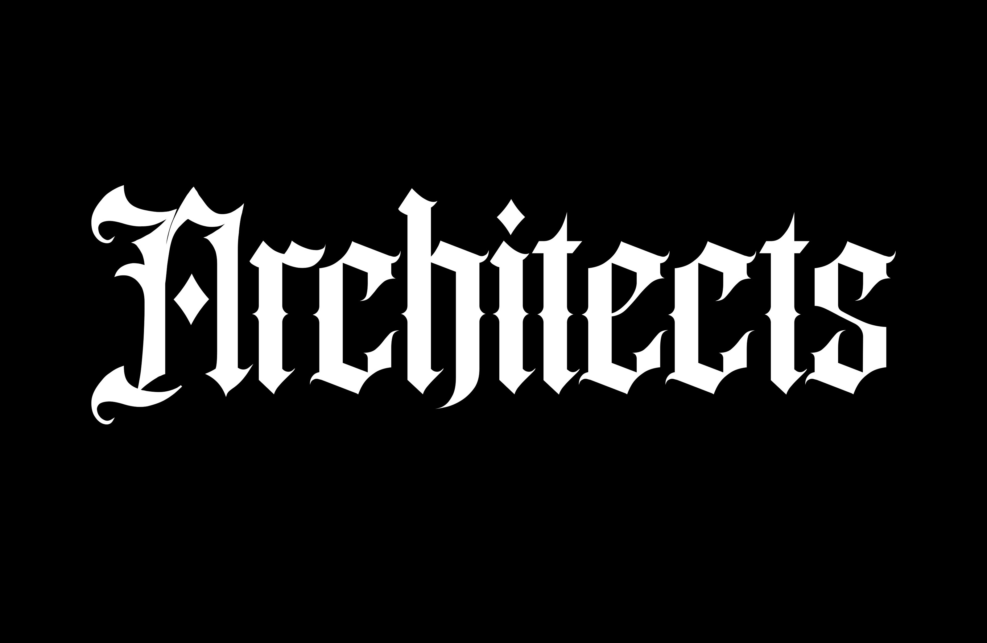
This logo calls back to some styling of the original architects "A" that fans know and features a matching set of the rest of the letters to create the entire logotype and a cohesive family.
I made sure to check that the logo would work for the various uses the band would have as well. Things like flyers, websites, social media posts, whatever
below are some in use of the logotype and “A”
Ultimately the management team went in a different direction. Sometimes client projects just don’t work out.
No shade at the Architects or the team I worked with they were great.
Hopefully though this little post can salvage the work in some aspect.
I’m still proud of the final application, I got paid, and this design work will be even more proof of concept for other dope bands who want to work together in the future.
Much love y’all!
Cool stuff to check out
Fav Design of the week below
Weekly Wrap Up
Starting a design studio, pricing work, & plagiarism in the design world!

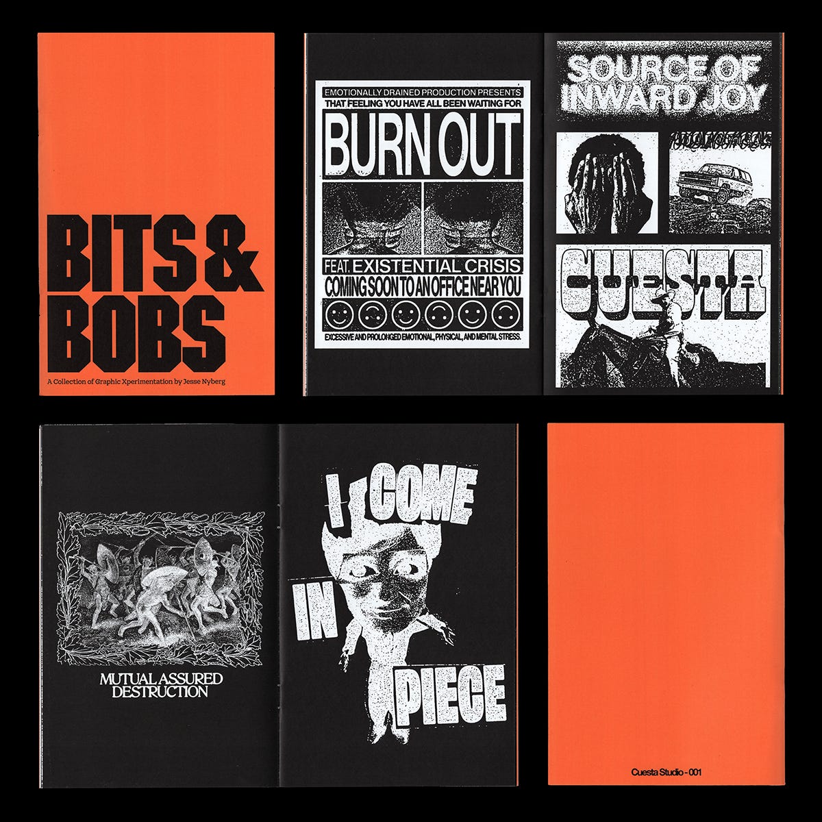
Bits and Bobs Zine almost sold out!
Thanks for reading!
I plan on keeping this newsletter free, but if you want to support, the best way is to share it with a friend :)